Brain Performance Institute by Page Architectural Record
Dallas
How is our brain changed by the space we work in? What does that space do to make us thrive? These are questions that animate Sandi Chapman, Ph.D., the founding director of the Center for Brain Health (part of the University of Texas at Dallas). Her inquiries are not just academic; at the Center’s new Brain Performance Institute—where clinicians and therapists work to improve brain function in healthy people through preventive care, and treat brain-based conditions and disorders including dementia, PTSD, and ADHD—she has translated the ideas generated by these queries into the three dimensions of building.
 “A lot of clients don’t ‘get’ architecture,” says Lawrence Speck, the design principal for Page, architects of the 60,000-square-foot, $29-million facility. “She gets it. She sees architecture as a tool.” One of Chapman’s core principles is that there should be variation and surprise in architectural spaces. “This idea of a nimble environment is very good for the brain,” she says, indicating the need for movement between spaces. “We wanted each room to have a different feeling when you go into it, so you have a sense of unexpectedness.”
Chapman’s imperative for architectural diversity is manifest in the form of the institute, which the architects designed as, essentially, two interlocking buildings in one: an L-shaped clinical facility, and an elliptical atrium building wedged into its elbow. The curved component is not just an abstract formal gesture; it is a work of representative design, or architecture parlante, intentionally shaped like the brain’s frontal lobe. “This is the very front part of our brain that makes us different from every other living thing,” explains Chapman. “Architecturally, we created what we stand for.”
Chapman’s philosophy is also apparent in the institute’s entry sequence. From a landscaped parking area, visitors proceed under the shade of a long canopy, through a compressed, slate-colored lobby, and into the light-filled, three-story atrium, a gathering space and waiting area. An exposed stairway rises up through the ovoid room, leading toward a cable-suspended paraboloid ceiling of blonde wood slats that brings visual warmth as it dissipates sound. “The convex aspect transfers noise to the perimeter of the room,” says Ricardo Munoz, a project designer. At night, the building glows from within, advertising what is going on inside to passersby on the busy thoroughfare it faces.
A secondary entrance to the building, it should be noted, leads directly to an elevator bank, for those with conditions like PTSD, who do better without the “wow” factor. These patients can also decompress in “warrior lounges,” on the second and third floors of the institute. These niche-like spaces, paneled in dark wood and with plush seating, are designed for those who might not be comfortable in the atrium’s open settings, and are happier sitting in confined spaces where they cannot be surprised by someone’s approach. “Some veterans don’t like to be in open spaces, with people behind them,” says Chapman.
The elliptical volume is a bravura work of structural engineering, supported by a ring of 78 steel fins, each 62 feet tall, that encircle its perimeter. Designed in collaboration with the revered Dallas engineer Tom Taylor, the 20,000-pound elements march around the exterior, separated by tall windows, creating an accordion effect on the facade.
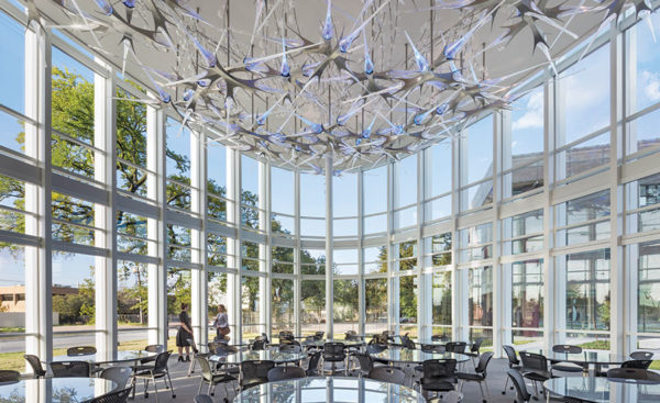
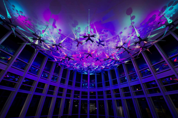
“We wanted something to awe you, because the brain likes to be awed,” says Chapman. “It changes the neurotransmitters.” A large multipurpose room with a 30-foot ceiling that occupies one end of the oval illustrates those transmissions with an art installation suspended from its ceiling. Created by David Gappa and titled Introspection, it is an abstracted interpretation of the brain’s synapses, their firings illuminated by LEDs embedded in glass tubes.
Contrasting with the rounded structure it embraces, the L-shaped form is clad in cool charcoal gray panelized fiberboard with vertical window frames outlined sharply in white. The private offices within have windows to the outside and translucent glazing facing the hallway, allowing light to filter into the circulation spaces. Clinical “brain-training rooms,” where clients can meet with clinicians for testing, counseling, or treatment, also line these corridors, and either admit daylight or block it, as per the demands of treatment.
“The thing Sandi said one thousand times was, ‘Don’t make it look like a hospital,’ ” says Speck. It doesn’t, nor does the office component look like a typical open-plan layout, something the architects also intentionally avoided in response to the client’s desires. “Open plan spaces can be devastating for brain productivity,” says Chapman. “People have to put on visual blockers and headphones just to keep from being agitated. They have to work harder just to do the things they’re doing.” At the Brain Performance Institute, the architecture should keep the mind engaged, if not excited, but without the agitation.


